

![[CSS] ✨ 4 cool things you can do with box-shadow](https://cdn.hashnode.com/res/hashnode/image/upload/v1631883770812/qAeQFz0e3F.png?w=1600&h=840&fit=crop&crop=entropy&auto=compress,format&format=webp)


I think it might even turn into a series! You know, X cool things you can do with Y. Might be fun! And it also looks like something both interesting and easy-enough to write, so I won’t start, just to ditch it after a while. Maybe!
So, ladies and gentlemen! Our first guest is box-shadow. Let’s welcome them to the stage!
1. 3D-like buttons
That one is kinda obvious and popular. But still, it’s cool! There are different approaches to “3D-like buttons” but this one allows for various backgrounds. You can use solid color, or gradients, or images, or mix of those — doesn’t matter. The “shadow” applies to inside of the element and shows “between” the text and the background of it.

.button {
  background: linear-gradient(90deg, rgba(131,58,180,1) 0%, rgba(253,29,29,1) 50%, rgba(252,176,69,1) 100%);
  box-shadow: inset 0 -10px 10px rgba(0,0,0,0.6);
  transition: all 0.2s;
}

.button:hover {
  box-shadow: inset 0 -10px 50px rgba(0,0,0,0.5);
}
2. Neomorphism
One of the newest trends when it comes to CSS and Web Design. Works well with a dark and light background (just can’t be totally white or totally black) and it’s… cute? It’s subtle and modern. Gives you the feeling of layers, without heavy-ish usual shadows.
.box {
  box-shadow: -10px -10px 30px -10px rgba(255,255,255,0.9),
10px 10px 30px -10px rgba(0,0,0,0.5)
}
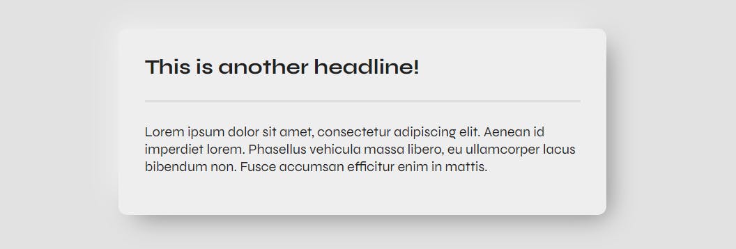
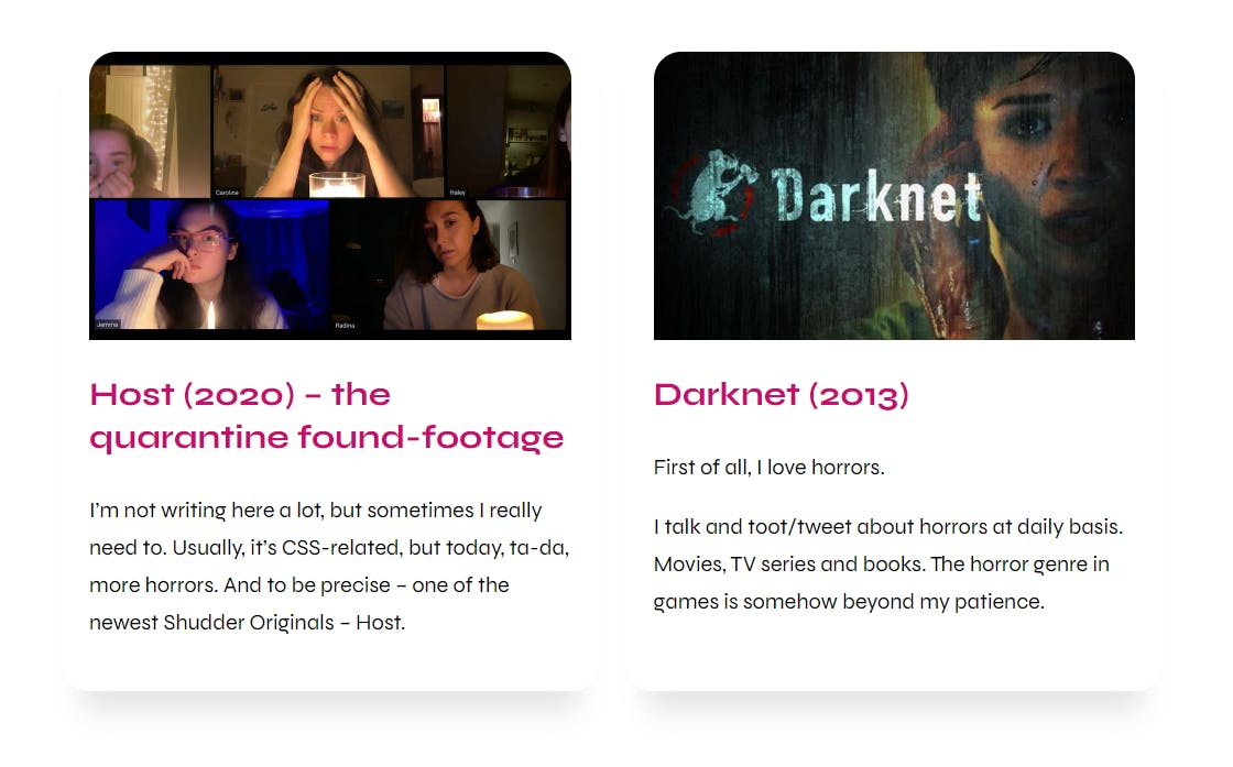
3. Product / Blog Post Cards
I remember a few years back when someone asked: “how to achieve a shadow, that’s not strictly under the element”. Meaning, it’s narrower than the box itself. With box-shadow and negative fourth value, it works like a charm! Just take a look.
article {
  box-shadow: 0 30px 20px -15px rgba(0,0,0,0.1);
}
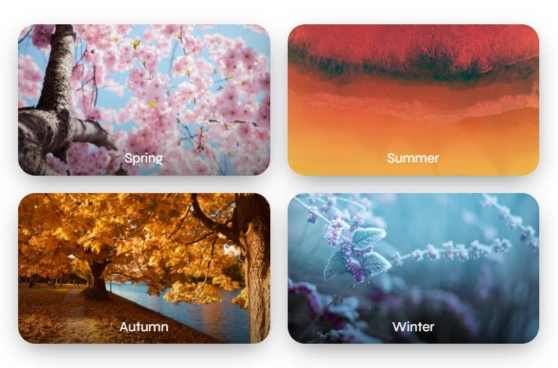
4. Overlay
There are at least a few ideas to achieve almost the same thing. While the usual approach might be with linear-gradient, I like to do it with box-shadow. There is a bit more… flexibility?
With shadow applied to :before we can even use mix-blend-mode and other fun stuff! The shadow also is not as straight, as it would be when using linear-gradient.
Before:
After:
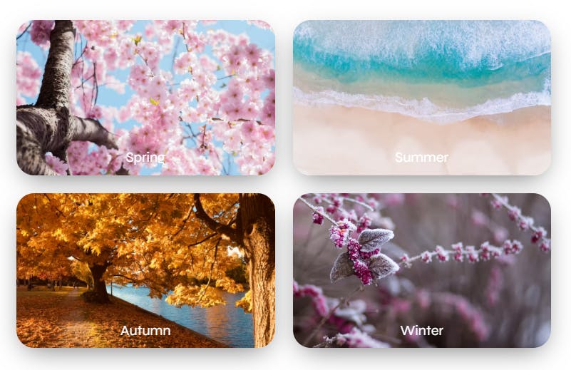
figure {
  overflow: hidden;
  background-size: cover;
  background-position: center center;
  box-shadow: 0 10px 30px -10px rgba(0,0,0,0.6);
}

figure:before {
  border-radius: 20px;
  overflow: hidden;
  padding-top: 60%;
  display: block;
  content: "";
  transition: all 0.3s;
  box-shadow: inset 0 -50px 100px -50px rgba(0,0,0,0.8);
}

figure.hot:before {
  background: #ff0000;
  mix-blend-mode: multiply;
  opacity: 0.7;
  box-shadow: inset 0 -100px 100px -50px rgb(255 204 10);
}

figure.cold:before {
  background: #80c8dd;
  mix-blend-mode: hard-light;
  box-shadow: inset 0 -100px 100px -50px rgba(0,0,0,0.8);
}

figure:hover:before {
  opacity: 0;
}
✨ Gradient “box-shadow” effect
That’s not exactly “box-shadow”. I mean, it is and it isn’t at the same time. It’s a shadow applied to a box, but I’m not using the box-shadow property.
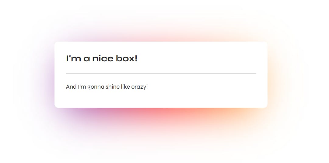
.glow {
  position: relative;
  background: #fff;
}

.glow:after {
  position: absolute;
  width: 90%;
  height: 80%;
  top: 25%;
  left: 0;
  right: 0;
  margin: 0 auto;
  z-index: -1;
  content: "";
  filter: blur(50px);
  background: linear-gradient(90deg, rgba(131,58,180,1) 0%, rgba(253,29,29,1) 50%, rgba(252,176,69,1) 100%);
}
I think it’s cute, and the fact, that it’s using just :after and doesn’t need anything in the markup, is definitely a plus.
Let me know if you'd like to read more posts like this! 🥰